Table of Contents
What is Responsive Design?
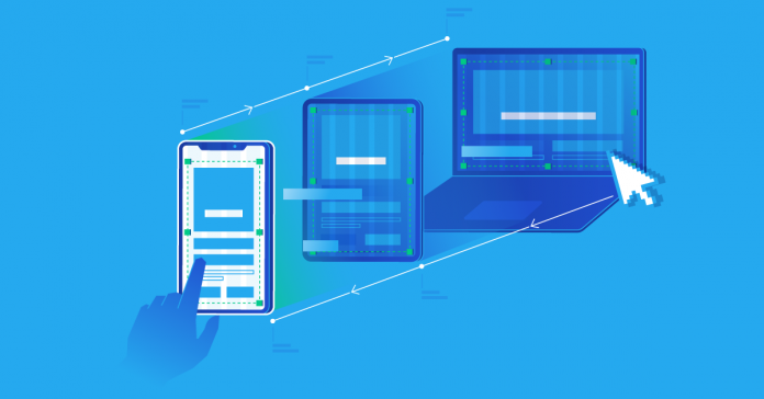
Responsive design is one of the most important advances in the recent history of web development. Prior to responsive design, you only really had two options when you designed a website. You could either construct a liquid site that stretches to fill the browser’s window as necessary or a fixed width site.
A fixed width site means that the size would remain the same no matter what and this fixed size was in pixels. However, neither of these approaches worked particularly well. Liquid sites ended up squished when viewed on smaller screens but the line lengths were far too long to read on larger screens. Fixed-width sites often have a horizontal scrollbar on smaller screens and too much white space at its edges on bigger screens.
The responsive design intends to eliminate these problems by combining three techniques: fluid grids, fluid images, and media queries. Fluid images are fairly simple and you just set the max-width to 100%. This means that images scale appropriately and never become larger than the column containing them. It also means that the image will not become pixelated in the event that the column grows wider than the image.
Media queries are the final technique. Media queries allow layout switches and this means that websites will not have only one layout, regardless of the screen size. Smaller screens can have repositioned sidebars or the website might show alternative navigation instead.
Is Responsive Design a Unique Technology?
You should know that responsive design is not a unique technology. Instead, responsive design is much more of a method of approaching web design, but you could also think of it as a list of optimal web development practices. These practices help construct a layout that has the ability to react to the device that you are using to see the content. Responsive design is now the expectation for web development rather than a new idea.
Fluid Grids
Fluid grids, which are also called flexible grids, are a crucial component of responsive design. Flexible grids mean that you do not have to specifically create a layout with just the right number of pixels for each device. Instead, you only have to include a breakpoint and make any changes to the design exactly where there is an issue, if necessary. This makes it easier for you to develop your website since you can easily fix any problems. You can take this into consideration on the S&OP side of things since you won’t have to spend as much time or money on such issues.
Modern Layouts
Multicol
There are many kinds of layouts for modern websites. One modern layout for your website is multicol, though it is the least recent out of the modern layouts in this article. Multicol means that you actually specify the number of columns you want to divide the content on your website into and the browser figures out the size of these columns. The size of the columns changes depending on the screen size.
Flexbox
Another type of modern website layout is Flexbox and this is also made using a responsive design. With this layout, flex items shrink and allocate space between each one of these items according to the amount of space that is in their container. This is the initial behavior of these flex items. You can also change the values of flex-shrink and flex-grow to alter how items behave when there is more space or less around them.
Responsive Images
Responsive images are part of a responsive design. You take an image that is as large as necessary and you scale that image down. Many web developers still use this approach these days.


